Whether you are a developer, designer, product manager, or someone else working to create digital products, you might wonder: What separates great products from good ones? Was it their attractive designs, their aesthetic, the methodology or technology used, or just a genius idea put into practice?
Although these things might be influential factors within a great product, the actual distinction lies in how a person feels when using your product. The gap between a visually polished enterprise product and one that people actually want to use is wider than most designers expect. Closing that gap is the real work of emotional design.
Emotional design is the strategic practice of creating software that deliberately evokes positive cognitive and psychological responses. Rooted in cognitive science and human-centered design principles, it recognizes that every interaction a user has with a product generates an emotional reaction. When technology leaders intentionally architect these reactions, they increase usability, foster deep user trust, and drive long-term brand loyalty.
Understanding how to integrate emotional design into complex enterprise architectures—without compromising security, scalability, or performance—is essential for modernizing legacy systems and launching successful new software products.
Every Interaction Has an Emotional Component
Here’s the thing that gets overlooked in most enterprise UX conversations: users don’t experience your product in a neutral emotional state. They arrive with a disposition — stressed, rushed, distracted, confident, uncertain — and that state shapes everything about how they interact with your interface.
Emotional state isn’t static, either. It shifts constantly in response to what the environment serves up. Three factors mediate those shifts: cognition (how users interpret what they’re seeing), disposition (how they’re feeling at that moment), and environmental context (where they are and what’s happening around them). A user accessing your platform from a quiet desk at 10am is a different user than the same person pulling it up on a tablet during a client meeting.
This matters for design because it means there’s no such thing as a neutral interaction. Every moment your product is in use, it’s either reinforcing a positive emotional state or eroding one. Researchers call this the Product-Emotion Cycle: the user feels an initial emotional response, which shapes how they behave with the product; the product responds to that behavior, which in turn produces a new emotional response. That cycle continues for the entire duration of the interaction.
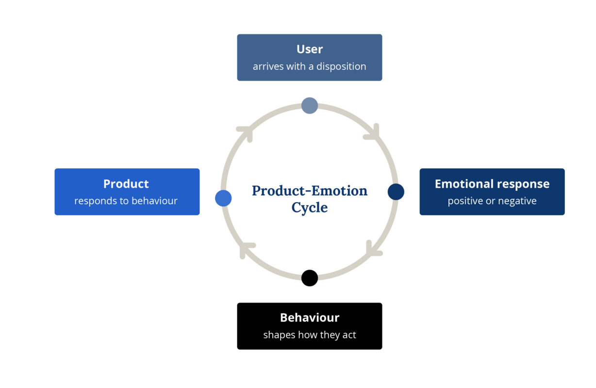
Successful products are the ones that keep that cycle positive — not by being entertaining or delightful in a consumer-app sense, but by consistently meeting user expectations, reducing uncertainty, and making people feel capable.
Two Frameworks Worth Understanding
Before getting into the specific design implications, it helps to have a mental model for what’s actually happening in a user’s brain during an interaction. Two frameworks are particularly useful here.
Don Norman’s Three Levels
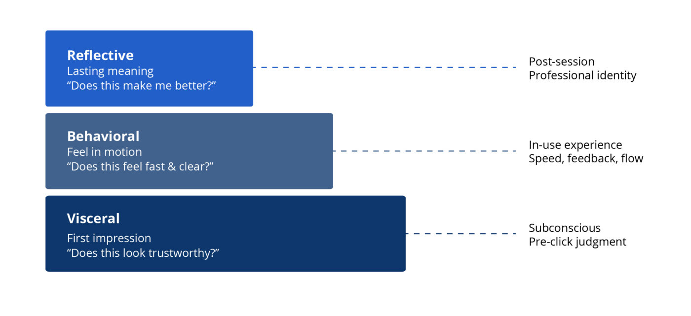
Norman’s framework divides emotional processing into three layers that every product experience moves through simultaneously.
Visceral is the immediate, pre-conscious reaction — the judgment formed before the user has clicked anything. In enterprise software, the visceral signal isn’t “this looks fun.” It’s “this looks trustworthy.” A dashboard with a clear visual hierarchy, consistent component behavior, and restrained color use tells a financial analyst or healthcare administrator that the system is competent before they’ve processed a single data point. A cluttered one signals the opposite — and that deficit of trust colors every subsequent interaction.
Behavioral is the feel of the product in motion: response times, feedback loops, workflow structure, error recovery. This is where enterprise emotional design lives or dies. When a user submits a multi-step workflow and stares at a vague spinner for eight seconds, that’s not a performance problem — it’s an emotional design failure. The anxiety that fills that silence is yours to design away.
Reflective is the question users ask themselves after the session ends: Does this tool make me better at my job? It’s the hardest layer to design for directly, but it accumulates from every small moment of respect or friction the product produces. Reflective value is the sum of hundreds of micro-decisions — how errors are handled, how onboarding treats the user, whether the search function actually finds things.
The Triune Brain Model
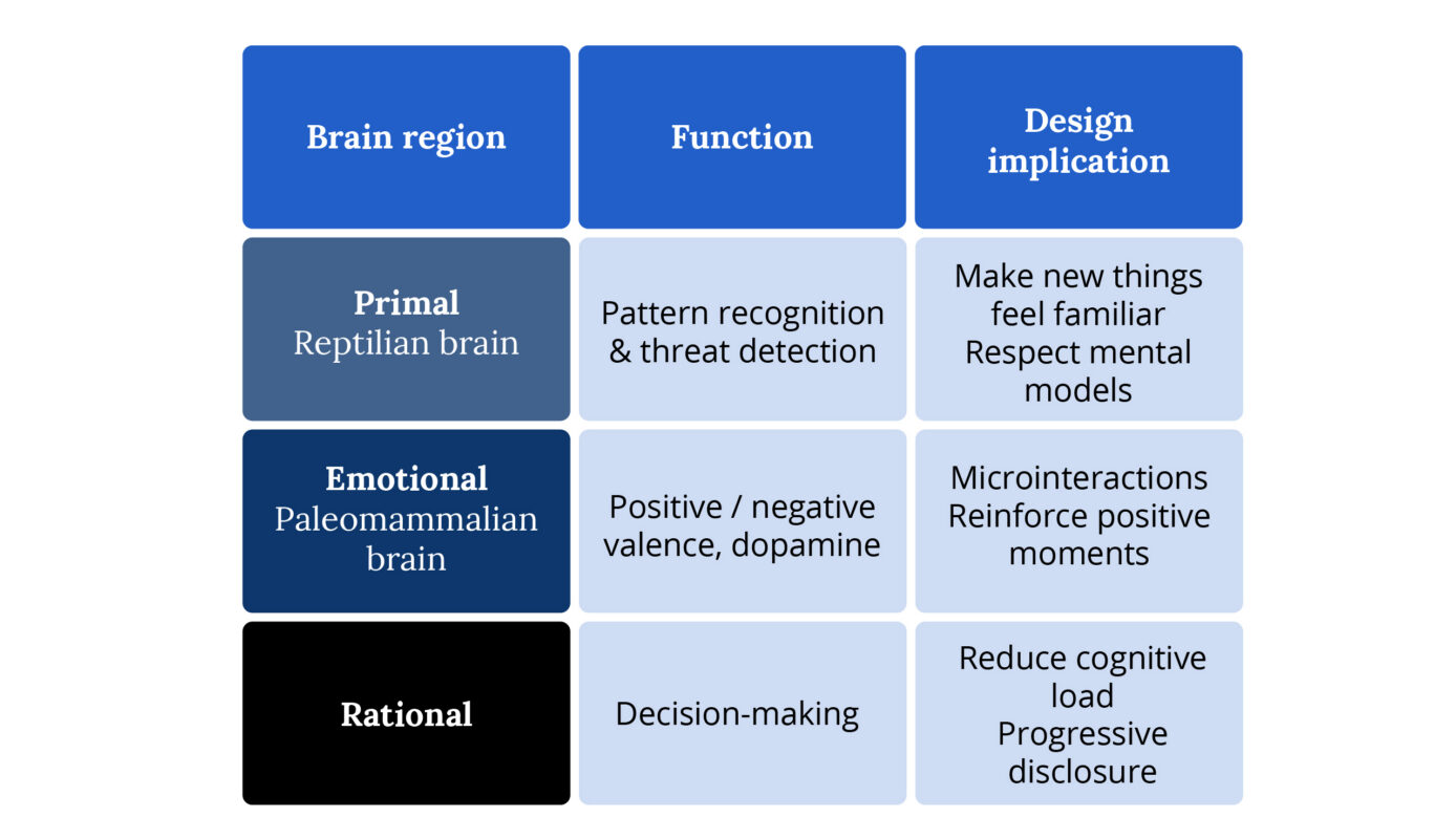
Paul MacLean’s model describes three regions of the brain that process experience differently, and each has direct implications for product design.
The primal brain operates on instinct — pattern recognition, threat detection, the snap judgment that something is safe or dangerous, familiar or alien. One of the most effective ways to design for this layer is to make new things feel familiar. This is especially critical in legacy migrations: users who’ve spent years in an old system have deeply encoded patterns. Your new interface, however objectively better, triggers a primal response of unfamiliarity that feels like risk. Respecting established mental models in your interaction design — preserving familiar structural elements while improving what’s underneath — is how you bypass that response.
The emotional brain is responsible for the positive and negative valence we assign to experiences. It’s also where dopamine reinforcement happens — the small hit of satisfaction when something goes right. In enterprise design, this is the neurological basis for microinteractions. When a form field glows briefly green after valid input, or a completed workflow produces a clean confirmation state, those aren’t decorative moments. They’re triggering a real biochemical response that reinforces continued engagement with the product.
The rational brain handles conscious processing — evaluation, decision-making, problem-solving. The key design principle here is cognitive load management. The rational brain has limited capacity, and every unnecessary decision, ambiguous label, or redundant piece of information draws from that capacity. In data-heavy enterprise environments, your job is to reduce what the rational brain has to work through — through visual hierarchy, progressive disclosure, and information architecture that surfaces the right thing at the right time.
Forget “Delight.” Think Emotional Architecture.
In consumer apps, emotional design often gets reduced to clever microcopy and confetti animations. In enterprise software, that framing will get you laughed out of the sprint review. Your users aren’t looking to be charmed. They’re trying to close a compliance report before 5pm, process 200 invoices before month-end, or pull patient records while a doctor waits on the phone.
What they need is something more fundamental: a product that makes them feel capable.
The three Norman levels and the Triune Brain model point toward the same design goal from different angles. Both tell you that emotional response isn’t a layer you add on top of a functional product — it’s generated by every structural decision you make. The visual system triggers the primal brain. The interaction patterns drive the emotional brain. The information architecture determines how hard the rational brain has to work. All of it adds up to how the user feels, and how they feel determines whether they trust the product, adopt it, and keep using it.
The Cognitive Reality You’re Designing For
Here’s the piece of research that should be pinned above every enterprise designer’s desk: positive emotional states broaden cognitive capacity. Negative ones narrow it.
When your interface frustrates a user — slow load, ambiguous error, broken visual hierarchy — they don’t just get annoyed. Their problem-solving ability actually degrades. They stop exploring. They stop trying to figure out the navigation. They call the helpdesk, or they give up, or they build a workaround in Excel.
When the interface works smoothly and feels trustworthy, users become more tolerant of minor friction, more willing to explore unfamiliar features, and faster at completing complex tasks. You’re not just improving “UX.” You’re directly affecting how well someone can do their job.
This means performance is a design problem. If you’re handing off specs without advocating for load time requirements, you’re leaving one of your most powerful emotional design levers on the table. Push for it in sprint planning. Make latency a design requirement, not just an engineering concern.
Where Enterprise Emotional Design Actually Gets Hard
Legacy Migration
When an organization moves users from a 15-year-old system to your shiny new platform, you’re not competing with other modern apps. You’re competing with procedural memory. Some of your users can navigate the old system blind. They know that pressing Tab six times lands them on the field they need.
Your job is to honor that expertise while building something better. That means doing the unglamorous research work: shadowing users in the old system, cataloging their shortcuts and workarounds, understanding which parts they actually like. The emotional goal of a legacy migration isn’t excitement — it’s continuity of confidence. If users feel less capable on day one of the new system than they did on the last day of the old one, you have an emotional design problem regardless of how good the interface looks.
Data Density
Enterprise users live in data. The temptation is to clean everything up into a minimal, airy interface — but strip away too much and you’ve made experts feel like beginners, forcing them to drill down to find information they used to see at a glance.
The real skill is hierarchy, not reduction. Use whitespace to organize, not to hide. Give power users density, but structure it so the eye has clear entry points. Progressive disclosure is your friend — not to protect users from complexity, but to let them choose their own depth.
High-Stakes Interactions
When a user is about to submit a regulatory filing, execute a large financial transaction, or update a medical record, the emotional requirement is absolute clarity. This is not the moment for friendly microcopy. Every label, confirmation message, and error state needs to be precise, unambiguous, and calm. The “delight” in these moments is the user finishing the task feeling certain they did it right.
The Language Layer
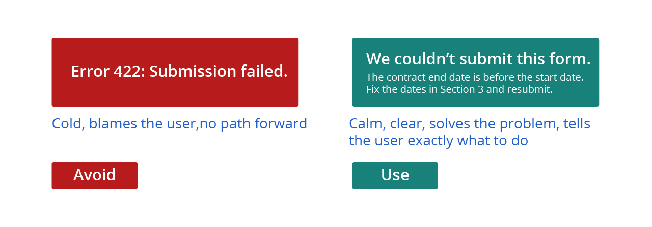
Visual design gets most of the attention, but UX writing is your most direct path to a user’s emotional state. Compare these two error messages:
“Error 422: Submission failed.”
“We couldn’t submit this form because the contract end date is before the start date. Fix the dates in Section 3 and resubmit.”
The first one creates anxiety and assigns blame. The second one solves the problem. Every error message, tooltip, empty state, confirmation dialog, and button label is a micro-moment of emotional design. Treat them that way.
The tone should flex with context. Onboarding: warm and orienting. Complex data entry: precise and focused. Errors: calm, clear, actionable. Never robotic, never patronizing.
Measuring Whether It’s Working
You can’t take “it feels better” to a product review. Here’s what to track:
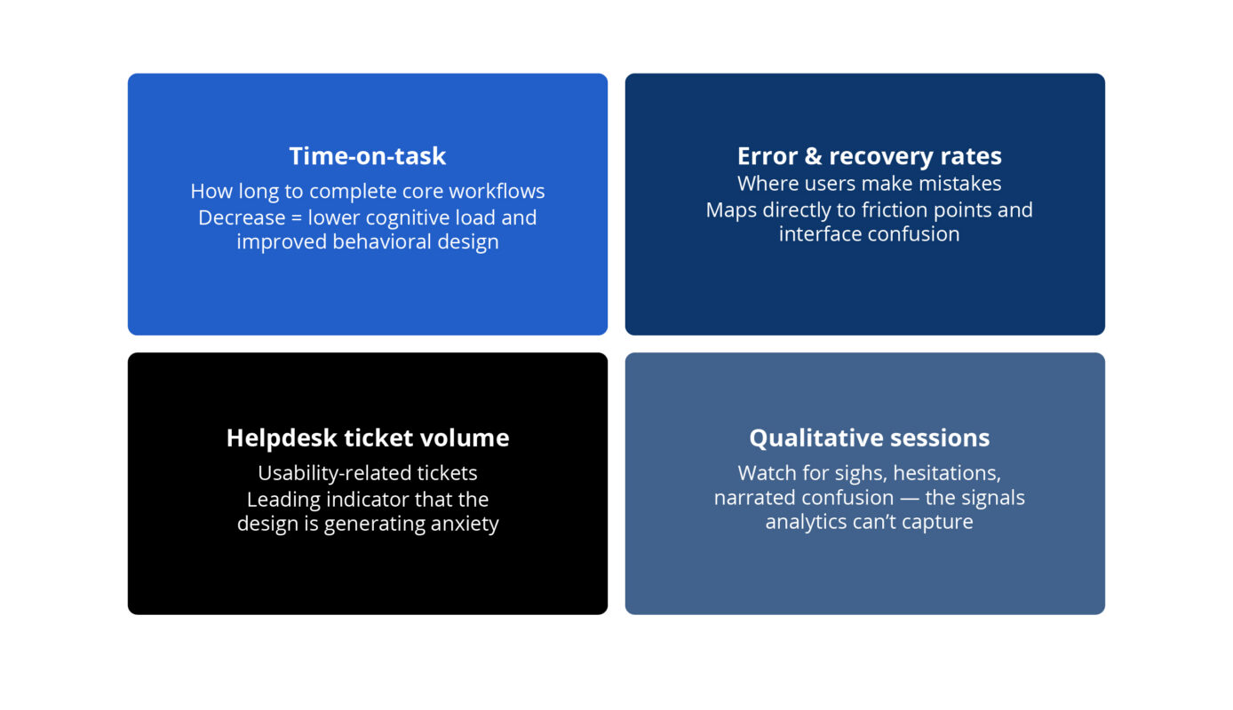
NPS and CSAT are useful over time, but nothing replaces watching a real user move through your product and noting exactly where their body language changes.
The Standard Worth Holding
Enterprise software has spent decades treating usability as secondary to functionality. The organizations that are winning right now are the ones that understand those aren’t separate concerns. How something works and how it makes someone feel are the same problem.
As a product designer in this space, you’re not decorating functional software. You’re shaping whether people feel capable, confident, and respected at work. That’s a meaningful thing to get right.
Originally published 2013, updated March 2026
Related Resources

How Better UX Turned a Rebrand Into a Revenue Breakthrough

Build It Right the First Time: Why User Research Can’t Be an Afterthought

How a Luxury Travel Brand Broke Free From a Decade-Old Codebase